Decision dataThe full read on wrist tattoos
| Signal | Verdict | Why it matters |
|---|---|---|
| Pain | 5/10 | Session comfort and placement intensity |
| Visibility | High | How noticeable the tattoo may be |
| Durability | Medium | Long-term visual readability |
| First-timer fit | Usually | Beginner planning fit |
| Best placements | Wrist Tattoos | Where this idea tends to work |
| Best styles | Minimalist, Fine line, Script | Styles that match the decision |
Fit check
Pros & cons at a glance
Works well when
- Best for: Small symbols, Short words, Minimal designs
- First-timer friendly: Usually
- Main tradeoff: High visibility and 5/10 reported pain.
Watch before choosing
- Compare size, placement, and long-term readability before booking.
Practical planning
Decision details for this topic
| Wrist area | Pain (~) | Visibility |
|---|---|---|
| Inner wrist | 5/10 | High; often visible in short sleeves |
| Outer wrist | Moderate | High; mind watch/bracelet overlap |
| Near palm crease | Sharper | Higher fade/movement risk |
Often a good fit when
- Meaningful small symbols and short script
- Moderate visibility without hand-tattoo commitment
- Many first-timer scenarios with simple designs
Often not ideal when
- Large compositions needing wide flat canvas
- Roles requiring completely hidden tattoos year-round
Size & spacing notes
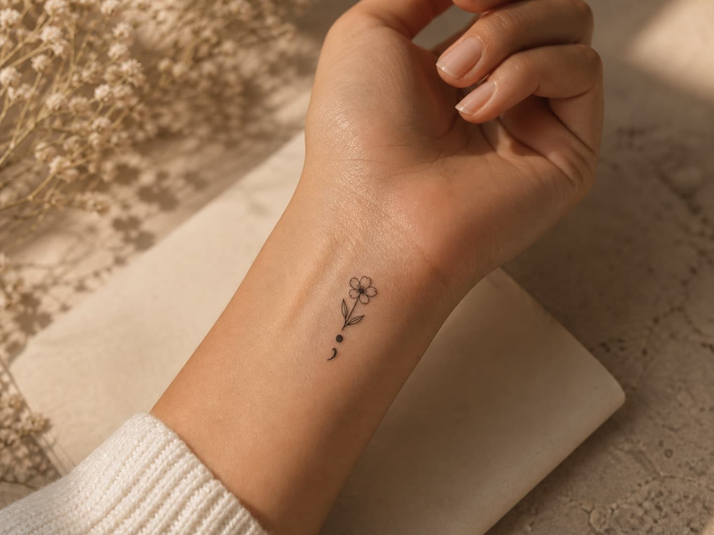
- Small symbols: 1–2 inches, placed away from the flex crease if possible.
- Short words: allow horizontal space so letters do not wrap awkwardly.
- Semicolon and similar marks: popular here — keep line weight readable.
Common planning mistakes
- Placing text exactly where a watch sits daily.
- Choosing inner wrist for a design meant to face outward.
- Ultra-tiny fine line without planning for touch-ups.
Wrist placement blends moderate pain with high visibility — a common choice for semicolon and minimalist symbols.
Search questions covered
- Are wrist tattoos a good idea?
- Wrist Tattoos pain and visibility
- Wrist Tattoos ideas
Before you choose
What to know first
Is the wrist a good tattoo placement?
Wrist tattoos are visible, compact, and popular for meaningful small designs, with moderate reported pain.
Wrist tattoo pain level
Reported pain is generally 5/10.
Visibility and lifestyle considerations
Visibility is usually high.
Show more detail
How wrist tattoos age over time
Long-term readability is generally considered medium for this placement.
Best styles for this placement
- Minimalist
- Fine line
- Script
Good design ideas
- Semicolon
- Small flower
- Tiny word
- Simple symbol
Pros and cons
- Best for: Small symbols, Short words, Minimal designs
- First-timer friendly: Usually
- Main tradeoff: High visibility and 5/10 reported pain.